I’ve been working on a redesign of the Homebrewery UI for a few months now. I have sort of kept the open Pull Request on Github up to date with where I am at, but I realizing that I have a website related to the Homebrewery where I can talk through it.
A few things to know:
- This wasn’t requested by anyone. Sure, some little UI improvements are requested here and there, but generally they are small things. Maybe the most common source of ‘dissatisfaction’ with the Homebrewery interface is from GM Binder users. These are people that used GMB, tried to switch to HB for a hot minute for whatever reason, and then bounced back to GMB because “Homebrewery doesn’t look good”, “isn’t pretty”, or “looks abandoned”.
- I don’t really use the Homebrewery. I don’t play D&D. I don’t write homebrew in any serious quantity (or, *ahem*, quality).
- I am doing this as an exercise in….I dunno, design? Learning? I’m not sure. I guess if I had to have a reason, it’s because I’m tired of telling people that the “Style Editor” is opened “by the little paint brush icon at the top of the editor, next to the i button”.
Undoubtedly there is more context I could start with, but let’s move on…
BrewItem
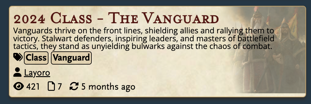
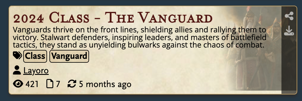
I am working on the BrewItem component right now. This is maybe not the best entry point to talking about a whole redesign, and it’s certainly not where I started the redesign, but it’s what is in front of me right now. The BrewItem component is the little card that represents a saved brew in both the Vault search page and the user brew list on the user page. Here is the current live site:


This is generally fine, and I don’t think I’ve gone overboard changing it. But some goals I had:
- Make it theme agnostic – drop the parchment background, and step away from D&D fonts.
- Promote the author name in hierarchy.
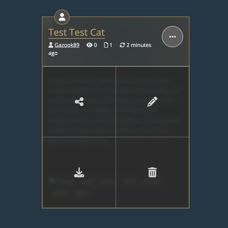
- Reveal the action buttons (‘share’, ‘edit’, ‘download’, and ‘delete’) with a button click, rather than on hover for better mobile experience.
- Open the brew Share page with a click of the brew title.
There are some other goals that are tied to the BrewItem, but are primarily handled in the vaultPage component:
- Every BrewItem should be the same dimension – the inner contents shouldn’t dictate the height independent of every other BrewItem.
- Utilize the Vault as both the public search engine and the place a user finds their own brews.
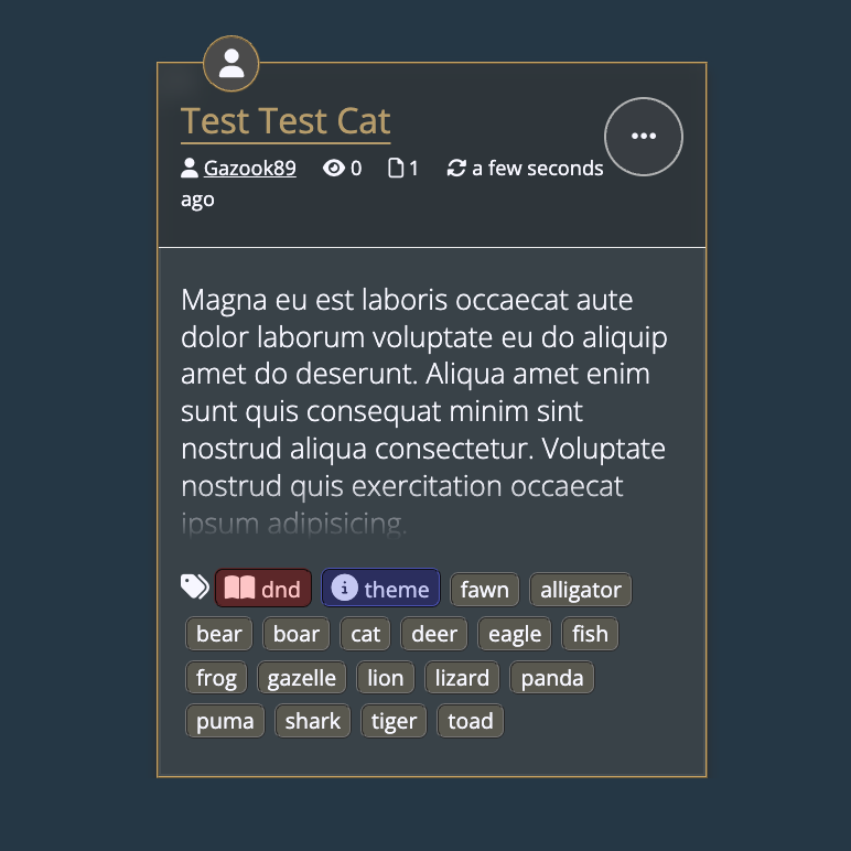
So with those goals in mind, I came up with this guy:


I think this hits every target. The title can be clicked through to the Share page. The stats are up top (though I see here that perhaps it’d be good to move the non-author stats down to a new line). The description area is limited to some degree and longer descriptions will get cut off– but I think this is worth the clarity on the overall page. Meta tags will be ordered first in the tags, which means tags like meta:theme and system:dnd5e will appear first. The large button in the header opens a group of large buttons for the actions.
In terms of using this for the User Page as well, the little “user” icon badge at the top of this brew denotes that this brew’s authors list includes my username. When perusing the Vault I hope that this badge makes it easy to pick out your own brews. The Vault will have additional options to filter to show only your owned brews, as well, so this isn’t the definitive way to find your stuff. Additional badges can fit up here in the future, such as badges that indicate if you are an Invited Author, or a brew is “pinned”, or “favorited”, or “locked”.
One last little feature is that this can be compressed down to a “list item”, with thinner rows:

Future Improvements
Some things I could improve yet:
- The action buttons could have a text label for each
- The Tags list could have a button above it to collapse it, so more of the description is visible. Alternatively, a button to either:
- expand the description area that also adds a scrollbar to it
- expands the whole BrewItem card such that it pops out (overlaps the other cards) using the HTML Popover API, revealing the maximal information about the brew, with full description, thumbnail, all authors, etc.
- The badges at the top can likely be moved someplace better in the “list” view.
This has been a test to see if I want to write more about my redesign, and more generally about Homebrewery development. It takes time away from actually doing the thing, but maybe it’s a good way to take a break, evaluate options, gain some perspective etc. Maybe it’ll encourage more input from users about what they want. But I want to make it plain that I am just one contributor to the Homebrewery, and that this redesign is definitely not pre-approved or inevitable. Even more definite, there is no timeline for this.
Let me know what you think in the #hb_suggestions channel of the Discord of Many Things or in /r/homebrewery.