Taking a look now at the pages that you hope to not see, the Error page and it’s various errors. Hopefully I can make the pages a little less of a bummer to see by steering away from “errors as brew documents” and maybe even adding some additional info to the error message to make reporting it easier. This is part of a continuing series about my effort to redesign the Homebrewery front-end, and there is a lot of pre-amble that was covered in the first post you should read if this is your first one.
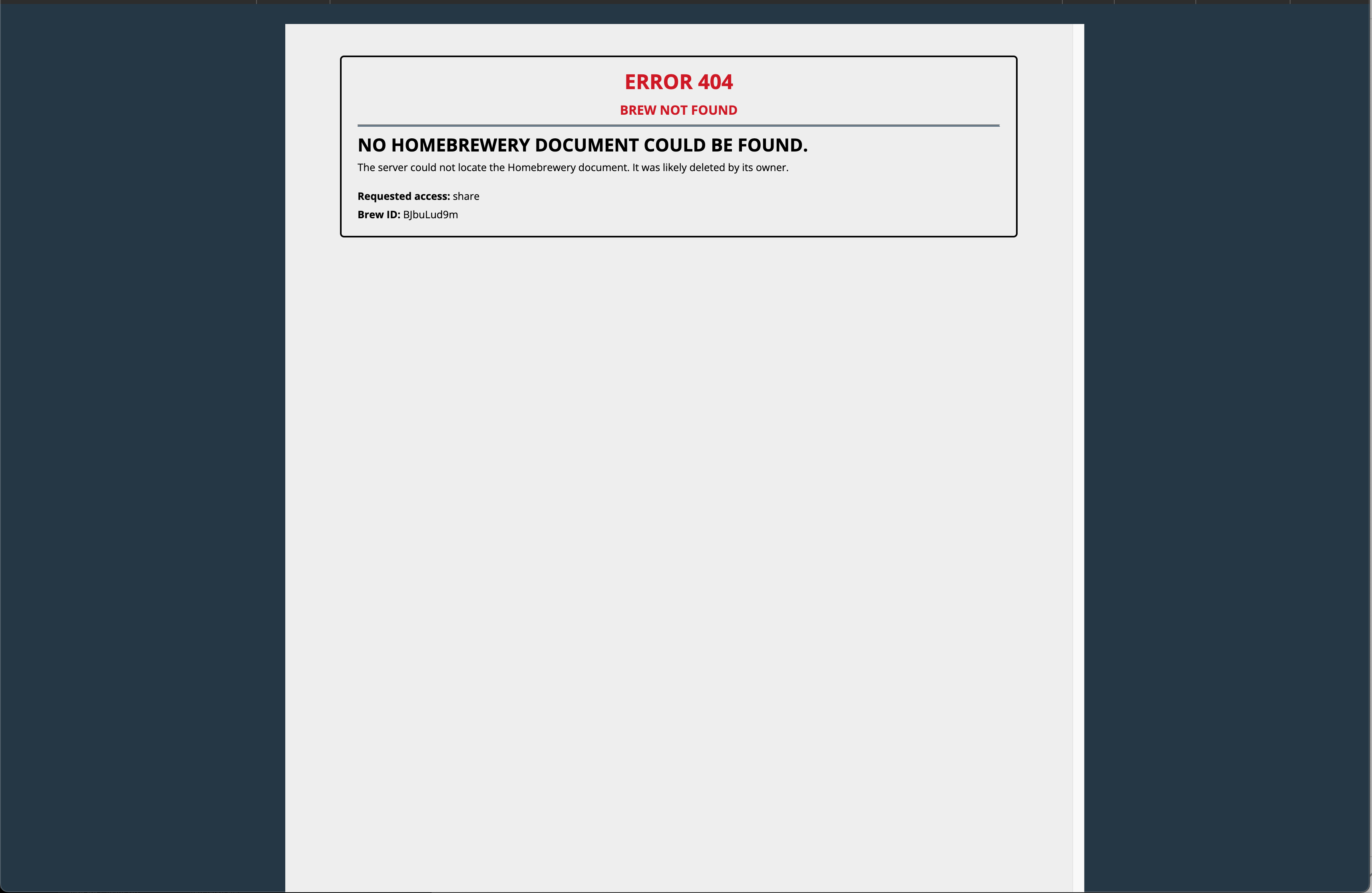
Let’s start by looking at an example of a current error page, such as what you see when you try to open a brew that doesn’t exist:

I’ve left out the top navigation bar in this screenshot but it also includes a “Crit Fail!” in the are where the brew title is normally displayed. Together with the red, bold and uppercase text and uncharacteristically unstyled plain “page”, it just seems fairly harsh. Error pages should be direct and clear, but this feels direct and clear and like it’s my fault.
This is the shape that every error takes if it results in a brew page (either Edit or Share) not displaying. The text obviously varies but it has the same standard form.
What I want to do with this is:
- Soften the visual style and come away from the idea of utilizing a “brew page” as the backdrop.
- Provide additional information about the error
- Ideally provide a “next step”, whether that is offering a link to the Vault Page to continuing to search for brews, or links to report the issue to Github or /r/homebrewery, or navigate to the log-in page if the user isn’t signed in yet.
Ideally a user can hit this error and not reflexively think “oh no, what did I do wrong?”
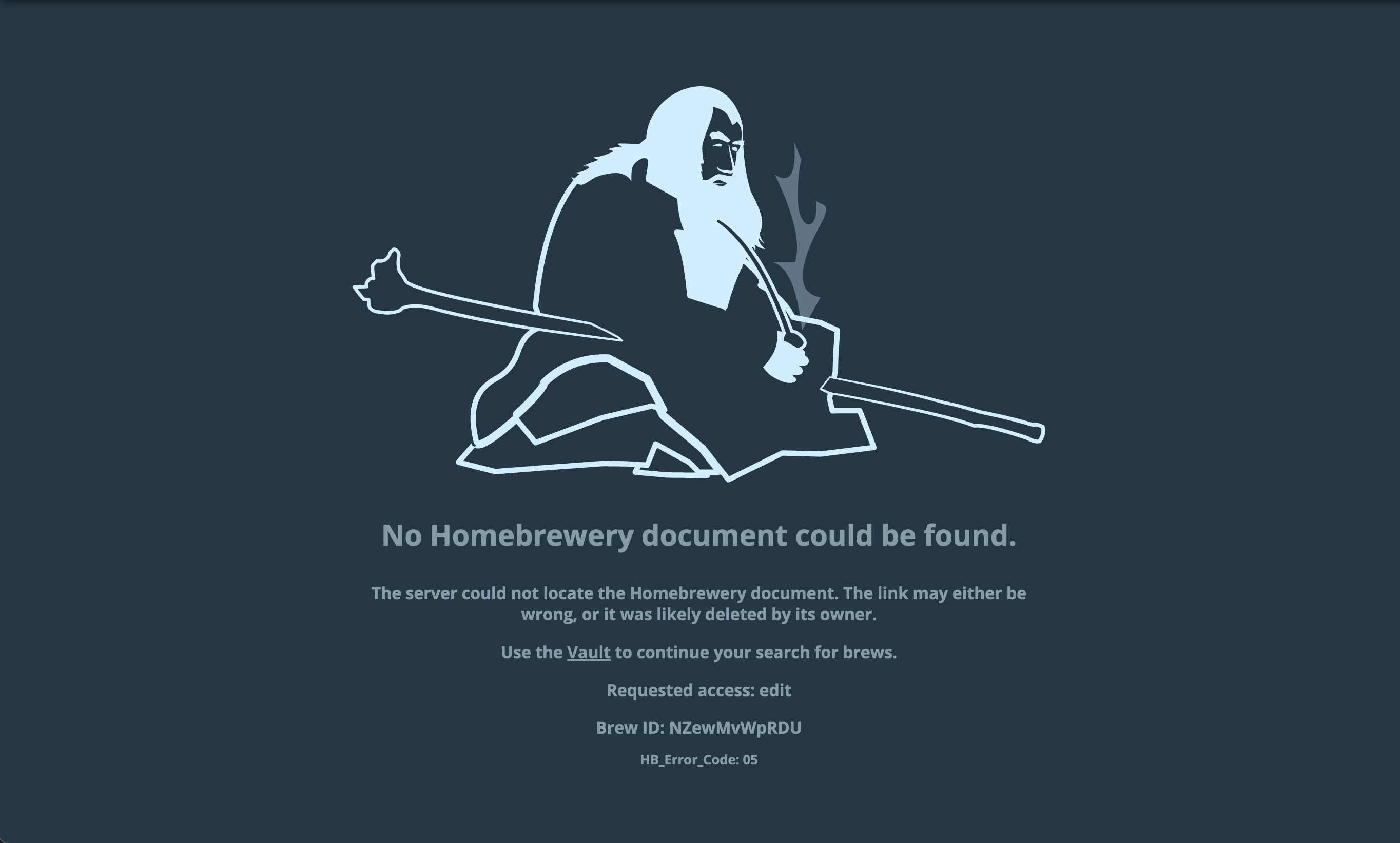
So here is my take on it:

Not hugely different, but it includes the HB error code which makes it easier for developers to look up, and for this specific error an option to search using the Vault page. In the repo there is a method to add custom error graphics for each error, as well.