The Edit Page is where most of the action happens on the Homebrewery; the page has the heaviest UI with more buttons, forms, menus and other elements than any other page. Most of them today are all treated as unique items. When I started this redesign I wanted to see what components could be combined (in their underlying code), as well as see how the user interaction could be improved.
In this post is going to focus on the Editor, not necessarily the Edit Page as a whole. So that means the Snippet Bar and the text editor (CodeMirror editor).
This is part of a series about my proposal for a redesign of the Homebrewery UI. There is a lot of pre-amble about this not being inevitable, not pre-approved, barely discussed, etc. You can read about that in this previous post, here.
This whole redesign pretty much stemmed from my experience helping new users and repeatedly uttering this phrase:
“You need to open the Style Editor (the paint brush icon above the editor next to the “i” button)…”
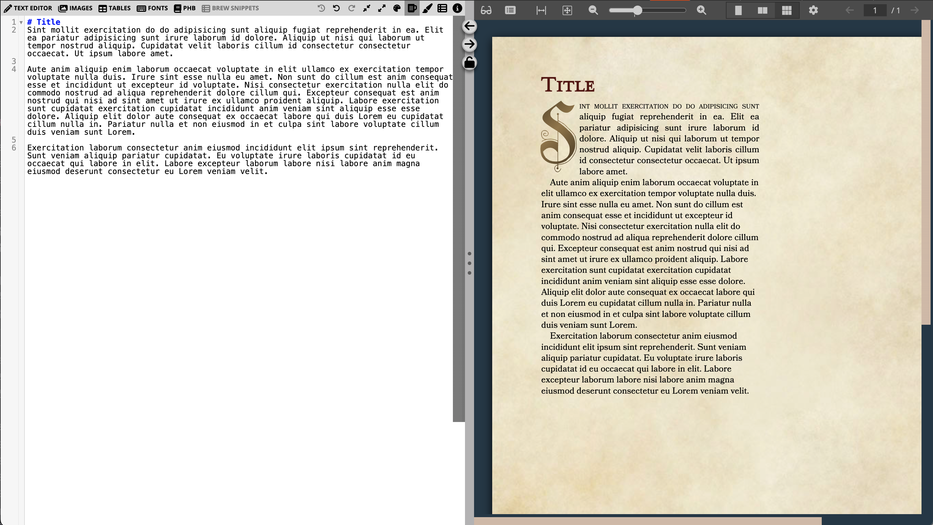
So the first stop for me when tackling the Editor would be to find a way to add a text label to that icon, without overwhelming the Snippet Bar (the menu bar that those buttons reside in).
Some other things related to the Editor that I thought I could put a new spin on:
- More subtle scroll bars, including reintroducing the scroll track in the Editor.
- Showing HTML errors in the Editor, rather than as a big banner in the BrewRenderer (the preview pane on the right).
Snippet Bar
Main goal here is to get some text labels for the different editors (Brew, Style, Snippets, and Properties) so we can just say “Open the Style Editor” without having to describe the icon. One step further is to make it easier to remember which is open at a quick glance. And because we just added another editor in the last few months, the Snippet editor, it’d be nice if we could avoid things getting too crowded up there.
Currently the Snippet Bar has two visual states, depending on the width of the pane:


And a severely limited width looks like this:

The double row stacked approach was added more recently (though probably a year or two ago, it’s hard to remember) to help with the problem of overflow at lower widths, which is exacerbated by more and more snippet menus. It was a pretty good solution and works fluidly and quickly. However, neither in the expanded state or the stacked state is there any clarity that the Editor buttons are distinct from the other tools that precede it, like the Undo/Redo or Expand/Fold code buttons.
Switching between editors is akin to switching tabs, so I wanted to represent them as such. I’ve promoted the tabs to the topmost spot in the hierarchy, the upper left, and given them full text labels with their own color schemes. The lesser used tools are pushed to the side, and the snippet menus are now always their own row (when available).


This can be compressed to a lower width before the UI shifts, because it is at minimum two rows. It’s basically a recognition that the Homebrewery has added enough features and corresponding UI elements since it started in 2015/16 that we just need that additional space. Avoiding layout shifts, even at the loss of Editor real-estate, is worth it, in my opinion.
The Snippet Bar can be compressed further, resulting in the loss of the text labels but maintaining that sense that the Editor tabs are important. Maintaining the colors can help bring focus to those buttons, and keeps the ease in directing users with “You want the Style Editor, the blue button on top”.

The Snippet menus opt to wrap to another row while maintaining their text levels, up until there is not enough space for the widest label, at which point they all shift to icon-only:
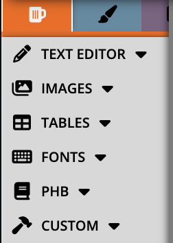
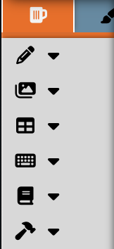
It’s not likely too many people are using the Editor at this width, even on a phone. Obviously this row wrapping is going to take up a good bit of vertical space in the Editor. But someone can still select whatever snippet menu they want even in a non-ideal Editor width (unfortunately, the same can’t be said for the Editor tabs above).
HTML Errors
I also wanted to move the errors that popup when you try to save with some sort of HTML or “rendering error” so that they appear in a more logical place than the BrewRenderer. Because the error is both occuring and fixed inside the Editor, it doesn’t make much sense to me that the error notifications should happen in the BrewRenderer:
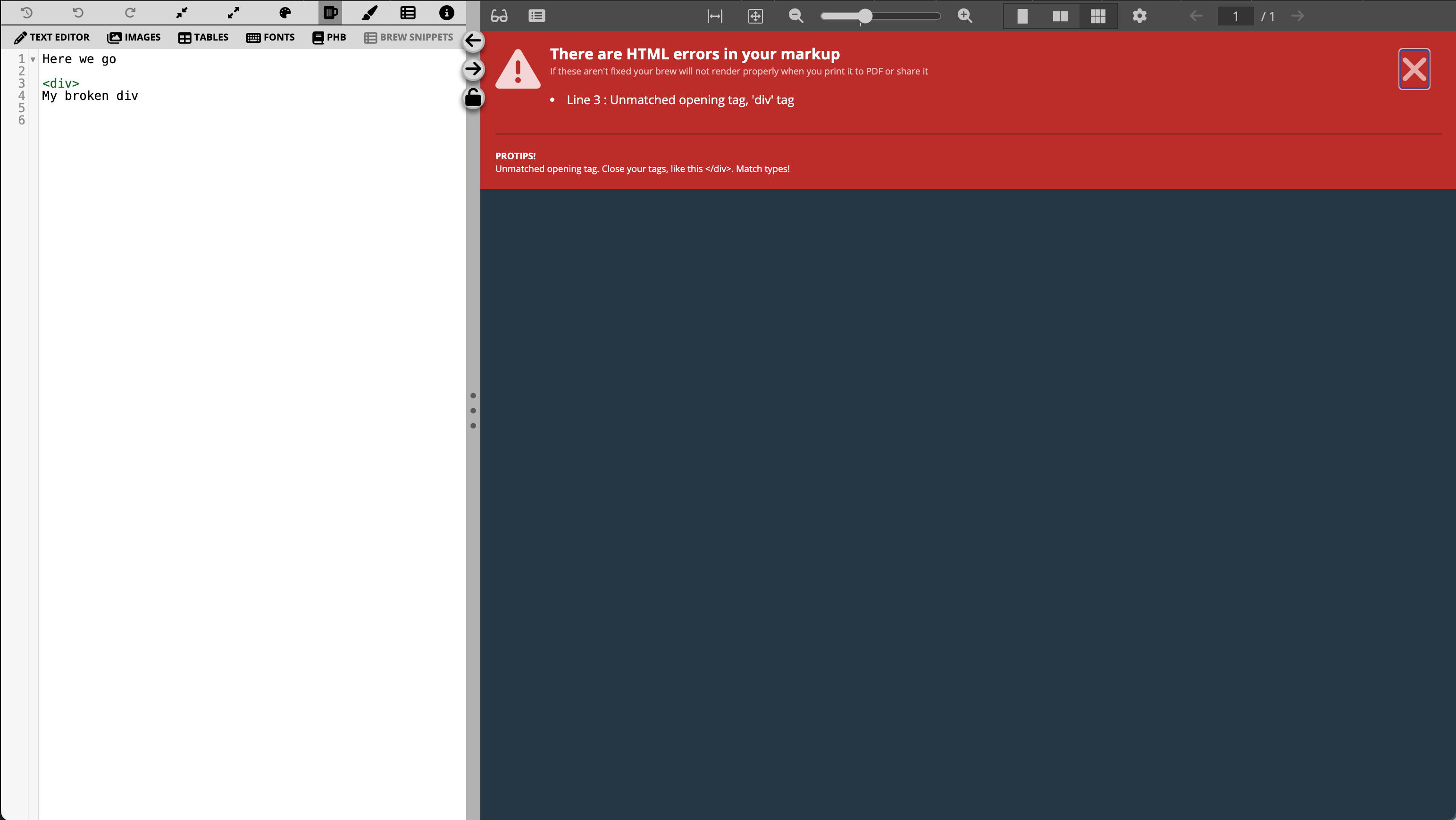
But really, there is nothing wrong with the content of the error. It gives a line number to look at, a description of the error, and some idea of what can be done about it. So let’s keep all that, but just throw it in the Editor:
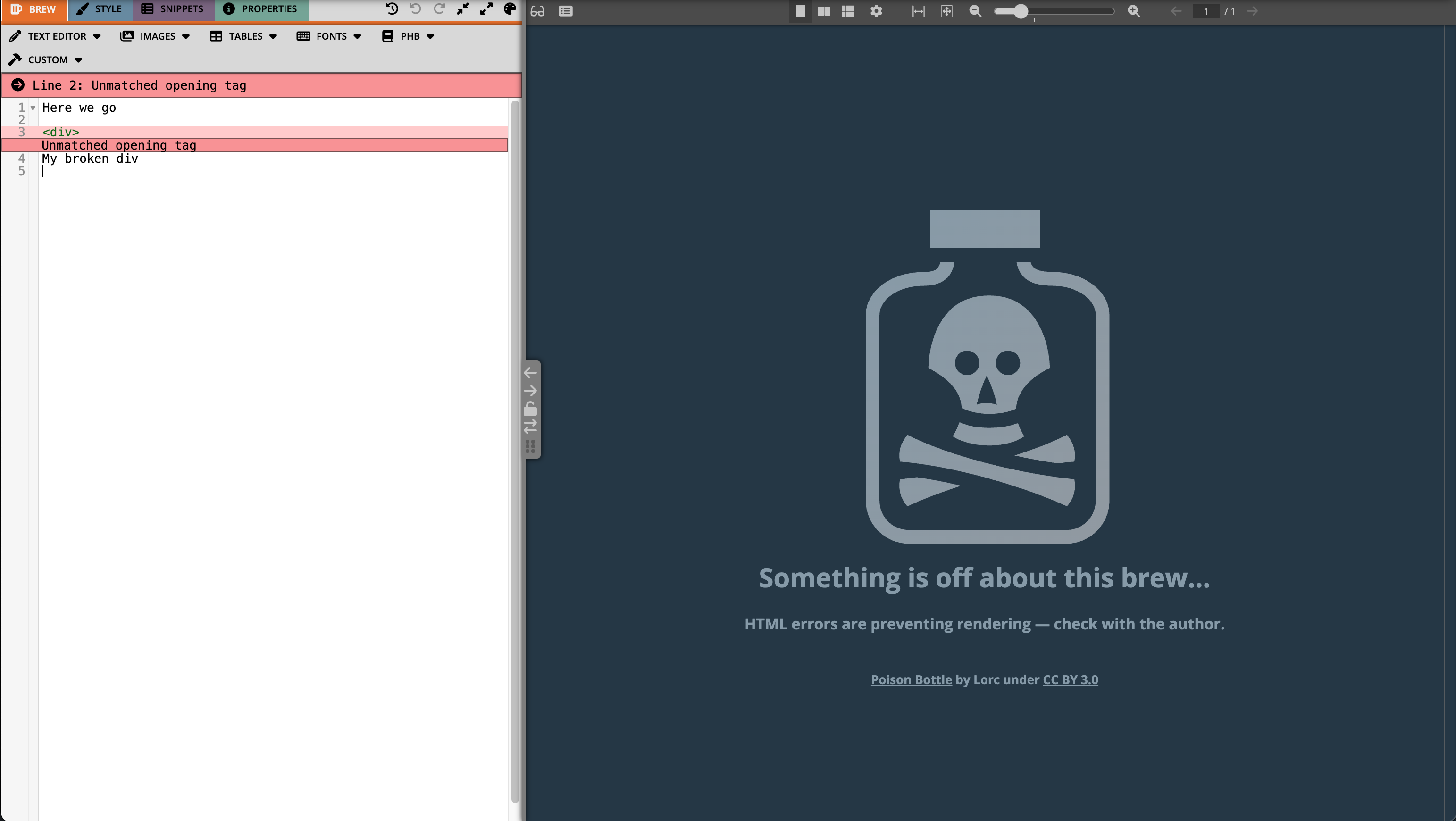
With this adjustment, we can see that we have essentially the same info. We get a summary of the errors at the very top of the editor as a ‘sticky’ panel– meaning it is always in view as you scroll through. There is also an error displayed just below the location of the actual error. The summary panel includes jump-to buttons to quickly bring errors into view. The BrewRenderer / preview pane displays the same error that other users will see on the Share page.
Scroll bars
Super simple change, this just undoes the styling on the scroll bar in the editor and changes the style of the scroll bar in the BrewRenderer. This is just a matter of preference for me. I like to have the edge of the scroll track visible, so I know where the edge of the editor is. It also adds some visual clarity to why the editor line backgrounds terminate before reaching the divider:

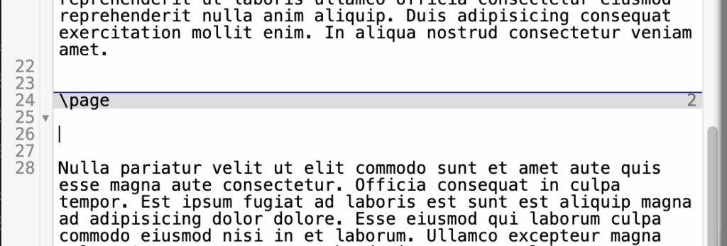
The scroll bars across the site get basically the same switch, though the coloring may be different in different spots. I’ll go into those in separate posts.
Overall, the changes to the editor don’t seem huge by themselves. I think that a lot of these posts are going to seem like that– not huge individual changes, but taken together makes the site a little more polished and cohesive.
If you have critiques or suggestions let me know on the Discord of Many Things in the #hb_suggestions channel where I’ll try to have a forum style post up for each blog post I do on the redesign.