Homebrewery has always been developed with only Desktop use in mind, and even more specifically, Chrome. There are a few reasons for this that I’ll skip over for now, but I’ve long felt that mobile use, even if not perfect, would be nice. Some people want just want to write while away from a computer, or they want to browse the Vault, or they may not actually have any access to a desktop.
Improving the mobile experience basically means reworking the UI to either be more flexible for different screen sizes, or coming up with more dynamic Javascript alterations to the UI on those smaller screens. These are things that can be done (and to a great degree, have been done in an old unmerged PR).
The problem
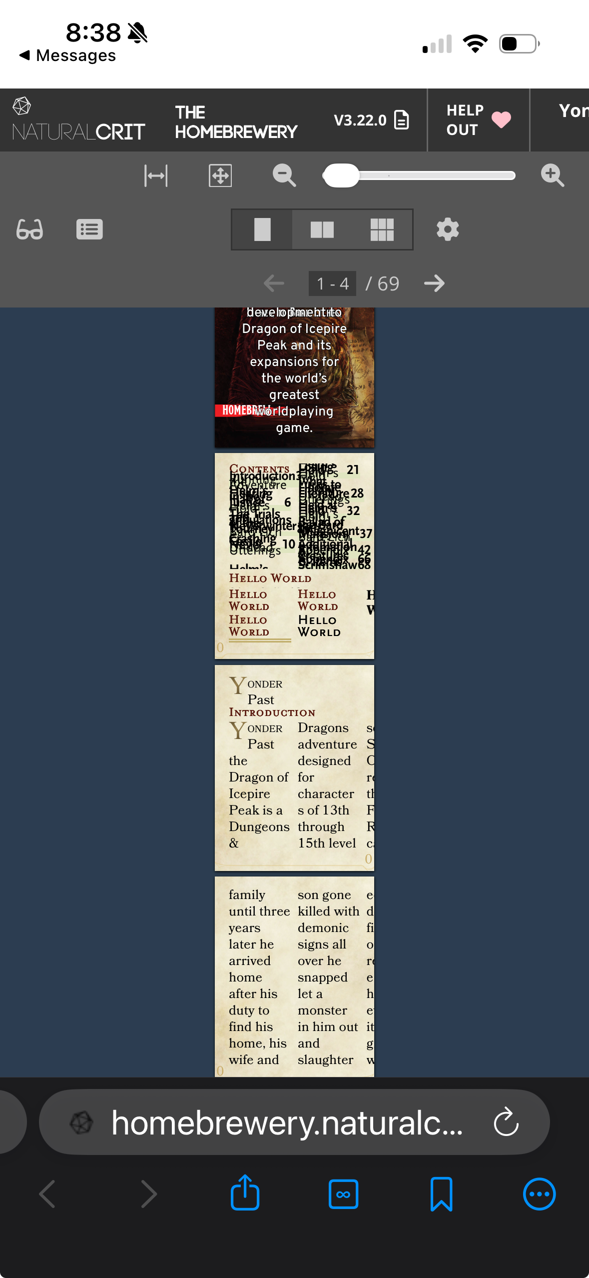
But there is one blocker for me that sort of makes me throw up my hands: setting the zoom of the Preview pane to a low enough number (so that the document appears smaller in the viewport) triggers an automatic text scaling algorithm on all text to force the visually apparent size of the text to stay above ~16px.
For example, I could set the Preview pane’s zoom level to 20%, so that the pages in the preview are quite small. The text, though, appears to stop shrinking. Via the Web Inspector, you can actually watch as the computed font-size of the text nodes increases at the same time the zoom decreases.
The container for the text is still shrinking, so you’ll only get a few words or characters inside that container as the rest overflows.
This auto scaling is to avoid accessibility issues, but in this context it really kills any motivation to even target mobile development; if I build out the UI such that mobile users can more easily use the site, it signals “hey mobile users, give us a shot!”, but then when they actually go to view their document it appears completely broken. Below is Android Chrome first, and iOS Orion (webkit) second:
Escape hatch?
Surely there is some sort of escape hatch for this behavior, some way to turn it off? Well, there is text-size-adjust and -webkit-text-size-adjust, with values none and <percentage>. Those should disable this text scaling, if I’m understanding it correctly. The recommendation is to use 100% to turn off the scaling.
Here is a test on CodePen:
See the Pen Untitled by John (@Gazook89) on CodePen.
The results:
unset | 100% | none | |
|---|---|---|---|
| Desktop (MacOS) | |||
| Chrome | no counter-scaling | no counter-scaling | no counter-scaling |
| Safari | counter-scaling at low end | counter-scaling at low end | counter-scaling at low end |
| Firefox | no counter-scaling | no counter-scaling | no counter-scaling |
| Mobile | |||
| iOS – Safari | counter-scaling at low end | counter-scaling always* | counter-scaling always* |
| Android – Chrome | no counter-scaling | no counter-scaling | no counter-scaling |
*counter-scaling always: the font-size and line-height are constantly manipulated to maintain one static visual size even if zooming in rather than out.
Conclusion
So there doesn’t seem to be any way to let text truly zoom beyond a certain point. Mysteriously, this seems to also be the case in Webkit for desktop, but somehow different than webkit on iOS.
Why not use CSS Transforms and scale()? Transforms visually change the element, but they don’t actually affect layout / the elements bounding box. CSS Zoom does change the bounding box dimensions, and thus preserves layout. It’s just that the text inside that box isn’t shrinking.
If anyone has a solid work around for this, [I’d love to hear it on the Homebrewery GitHub](https://github.com/naturalcrit/homebrewery/issues/3883).