In this other post I talked about how I am doing a redesign of the front-end of the Homebrewery. There was a lot of preamble in that post, and I’m just going to link to it here.
Vault
The last post was about the smaller single unit of the Vault page, the ‘card’ that displays for each brew in the returned results of a Vault search or on the User Page. This post widens the scope a bit to the whole page.
Here is the current Vault page:
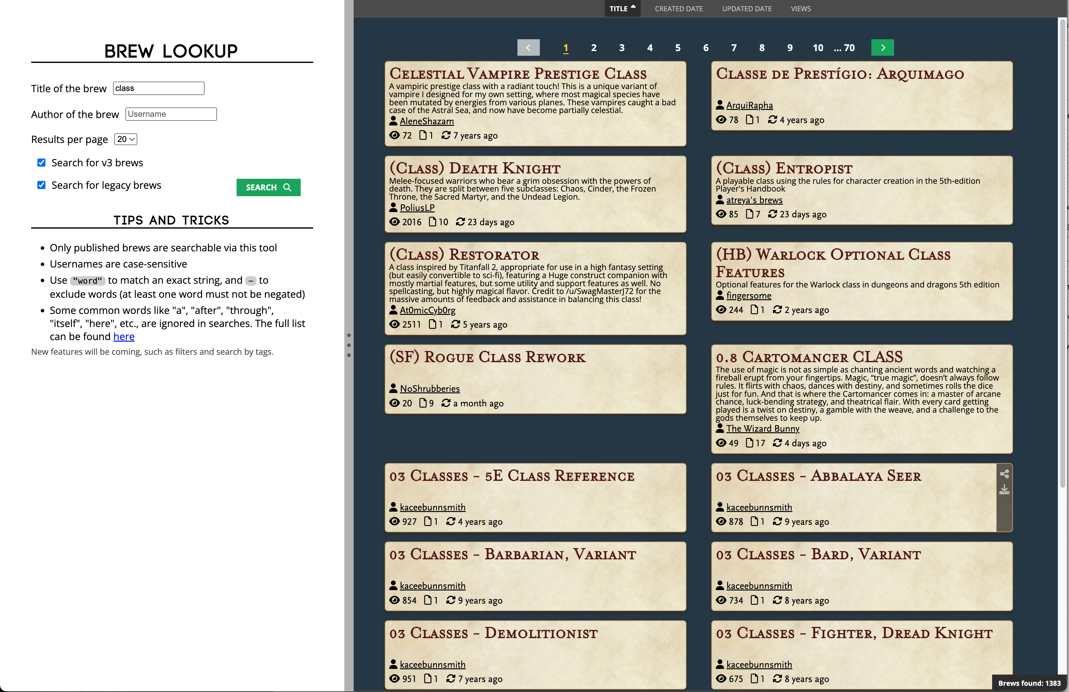
I’m not going to grab a screencap of every single possible state that this page can be in, but this seems representative of what most people will see after they’ve completed a search. Skipping over the actual returned ‘BrewItems’/results, we can see the search panel on the left and a ‘sort’ bar on the top of the right pane right above the ‘results’ area.
In my redesign I wanted to take a crack at:
- Blending the styling of the left search panel with other similar forms used in HB, and with the darker UI in general.
- Highlighting the number of brews found more, instead of being tucked in the bottom right corner.
- Standardizing the returned BrewItems and make them responsive to screen size.
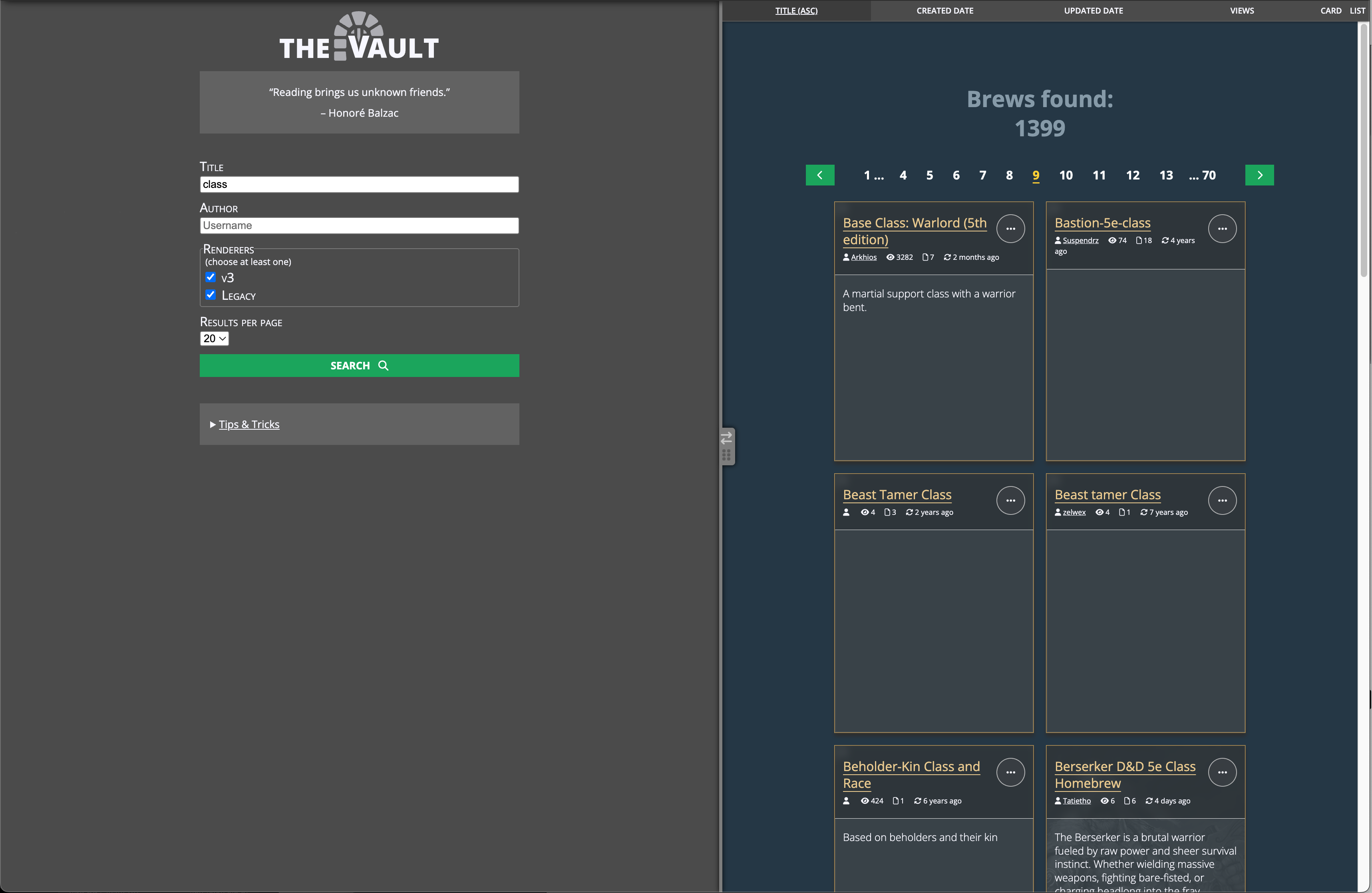
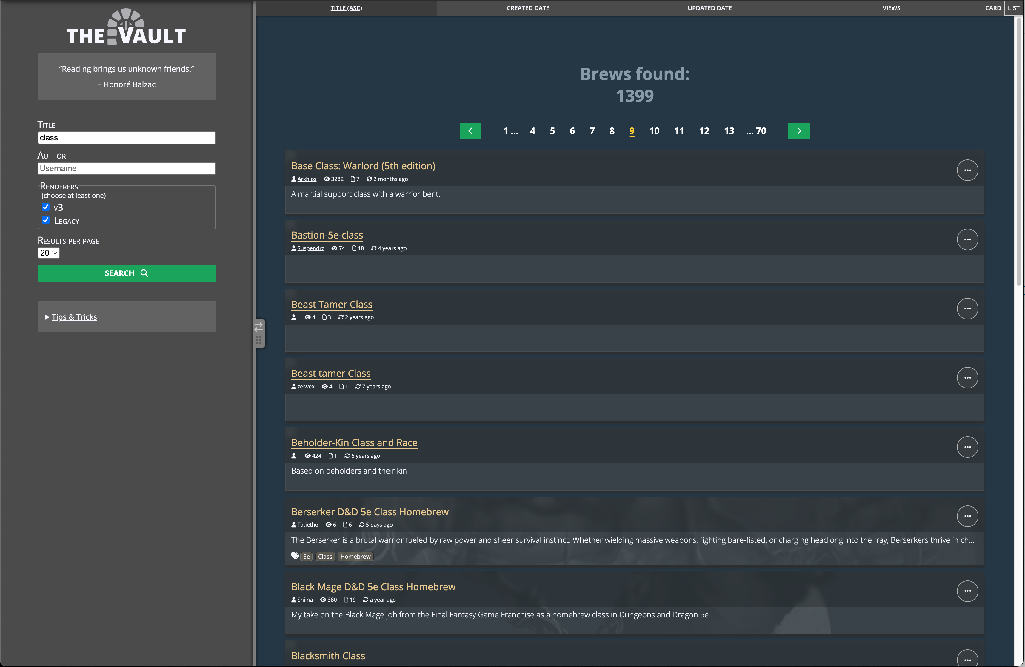
- Adding an option to view the BrewItems as a vertical list rather than ‘cards’.
Here is what I came up with:
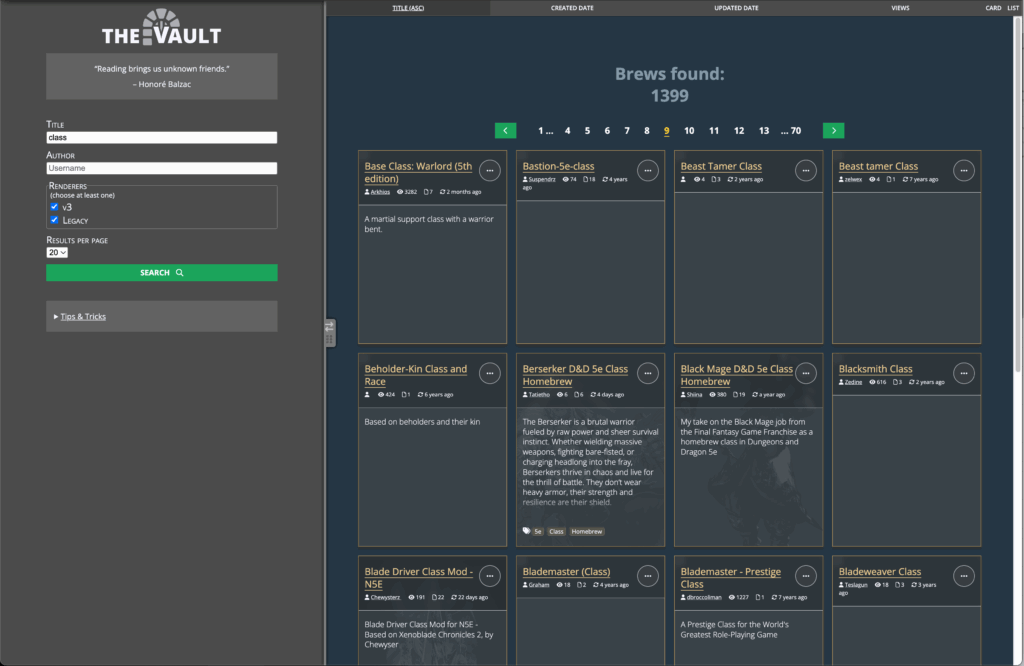
I think the aesthetic here is an improvement, more closely aligned with the rest of the UI. Also, the choice of renderers is more clear– previously, a new user might not understand that “search for v3 brews” and “search for legacy brews” had anything to do with a “renderer”, or even that they were related to each other at all.
The result of the search, the *total brews*, is shown right above the actual results. I think this also brings attention to the pagination bar just below it and adds some context as to why there are “…70” pages.
The BrewItem’s all have a standardized size, regardless of their contents, at the expense of limiting the number of displayed characters. Their headers (the area above the white line) faintly shift color on hover of the card, and the ‘options’ “…” button does the same.
And finally, the list is responsive and can be swapped to a “list” layout as well:
Additional Improvements
Some things I have yet to implement at the time of this writing, or issues I have come across just while writing this post:
- A toggle to filter to only “owned” brews, or “contributing brews” (brews where user is a listed author but not the first author).
- Finding a better spot for the “badges” that show across the top of the BrewItems that indicate owned and other statuses when in the “list” view.
- More search options, such as filters by tag, though these improvements will likely be further down the line.
If you have critiques of this, please let me know in the Discord of Many Things, in the #hb_suggestions channel– there is a corresponding forum post for this partiular page.